BRAND IDENTITY | MOBILE WEBSITE REDESIGN
Roberschan Environmental
I worked with an environmental consultancy to redesign the mobile interface of their website. My goal was to create a more intuitive and user-friendly experience, optimizing navigation and layout for mobile users. By simplifying the interface and ensuring responsive design, I helped improve accessibility and usability, making the site easier to navigate on smaller screens.
Year
2022
Programs
Adobe XD
Adobe Illustrator
Adobe Indesign
I: Assess
Before starting the redesign, I conducted a thorough assessment of the mobile interface to identify key usability issues. The website had been initially designed for desktop, leading to several components not translating well to mobile. To better understand the website’s audience, I developed a user persona, which guided my focus on improving the user experience. I prioritized enhancements in the following areas:
Landing page
Projects page
Contact page
Menu
II: Ideate
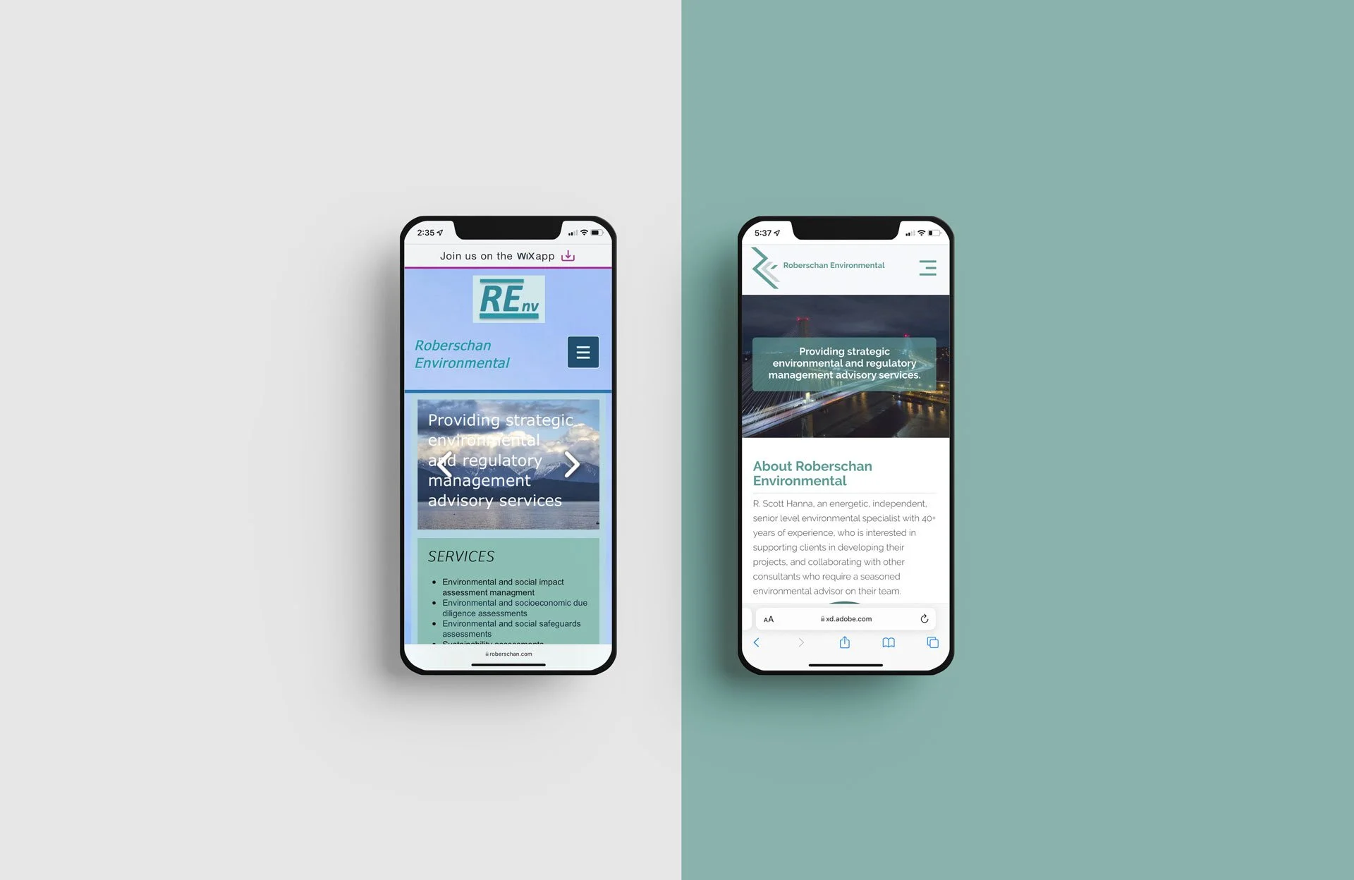
After assessing the site, I set out to give the brand a fresh and cohesive identity. I reimagined the logo with angular lines to create a more visually striking design. My evaluation also revealed that the site felt cluttered, with conflicting fonts and colors competing for attention. By simplifying the design, I aimed to better convey the consultancy's core values—precision and reliability.
Building on this new visual direction, I designed business cards to further establish the updated look and feel and reinforce a brand that is modern and professional.

III: Wireframe
I sketched a series of low-fidelity wireframes on paper before transitioning them into Adobe XD for further development. This stage is among my favourite parts of the design process, as it provides an opportunity to creatively problem-solve and refine ideas before bringing the interface to life with brand colours, fonts, and graphics.
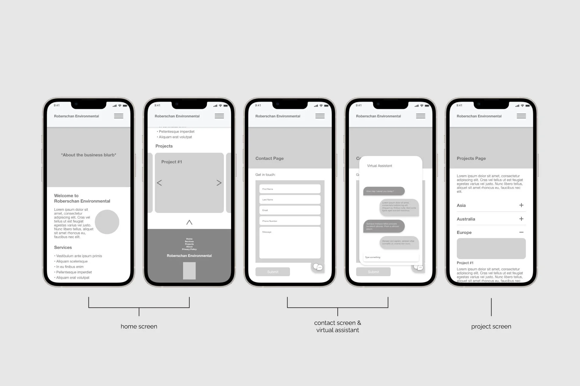
IV: Redesign
I aimed to simplify the overall layout by redistributing content and reducing the use of colour, opting to implement it in key areas such as text, call-out boxes, the menu, and other elements that needed to capture the user’s attention.
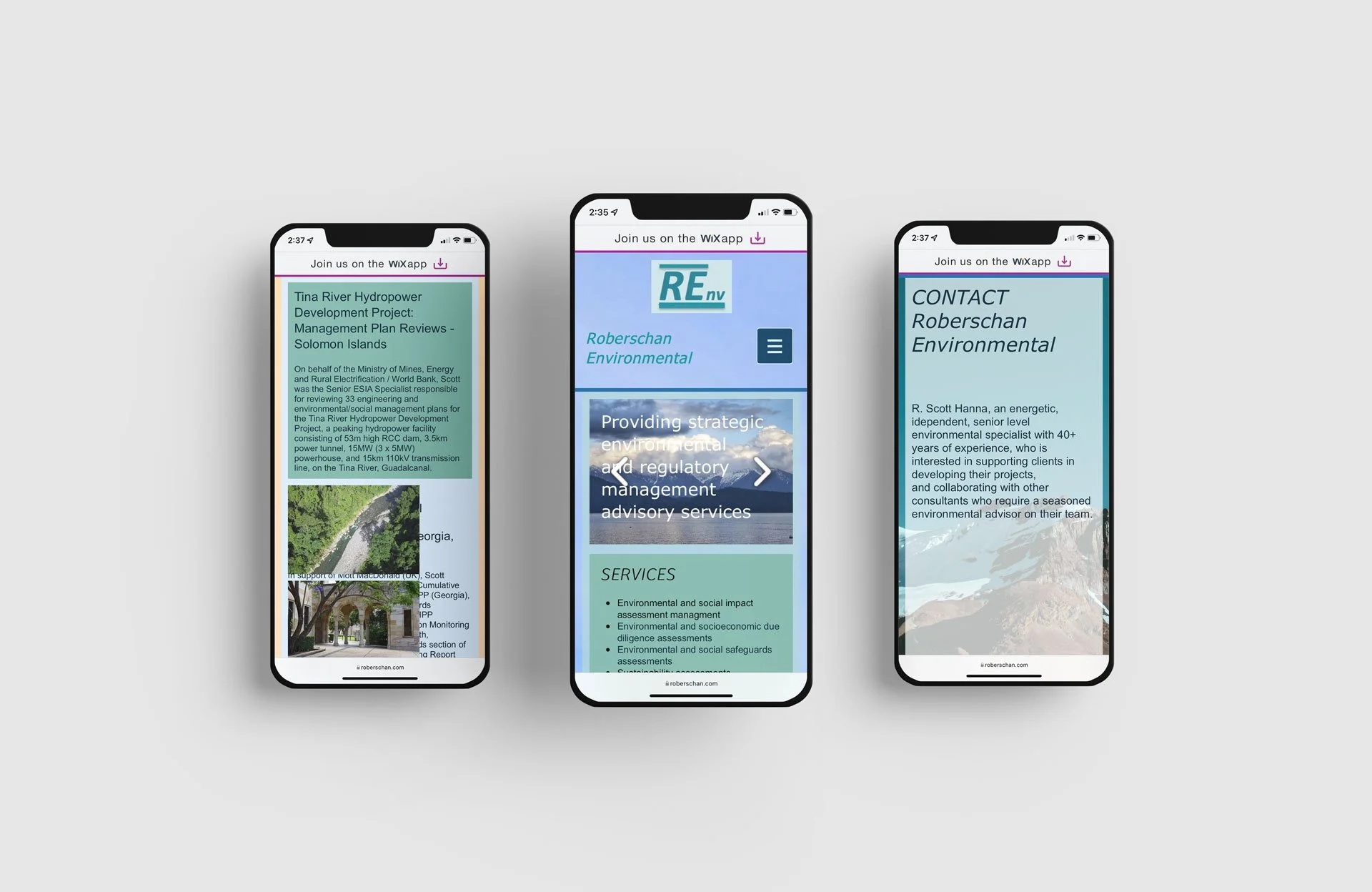
Landing Page
The landing page presented several challenges, most notably:
Overlapping content
Competing typographic hierarchies
Insufficient contrast between text and backgrounds
To address these issues, I first introduced a white background to enhance text legibility. I then established consistent paragraph styles to be applied throughout the site. By simplifying the graphic elements, I aimed to ensure that readers could easily consume content and navigate the site.
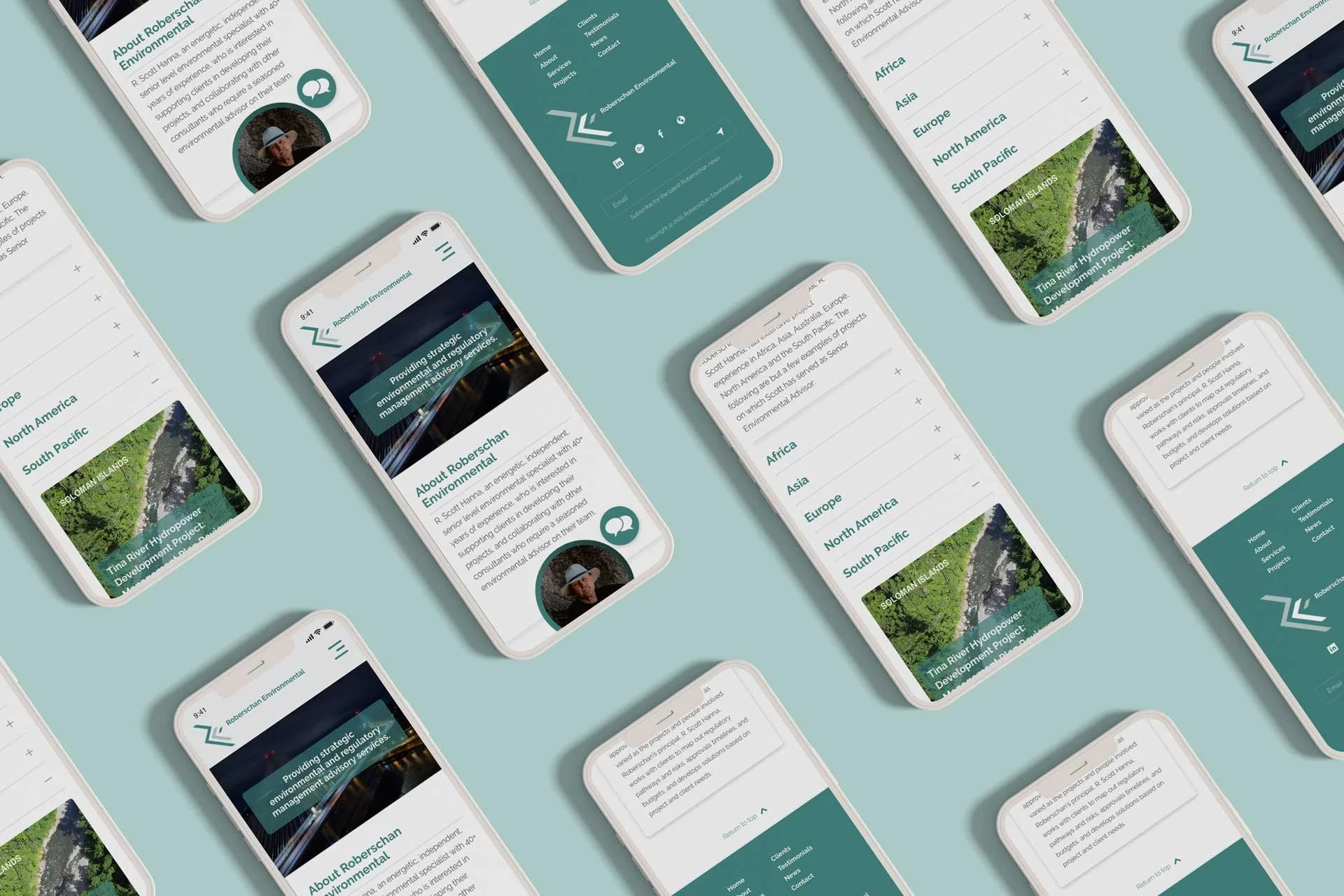
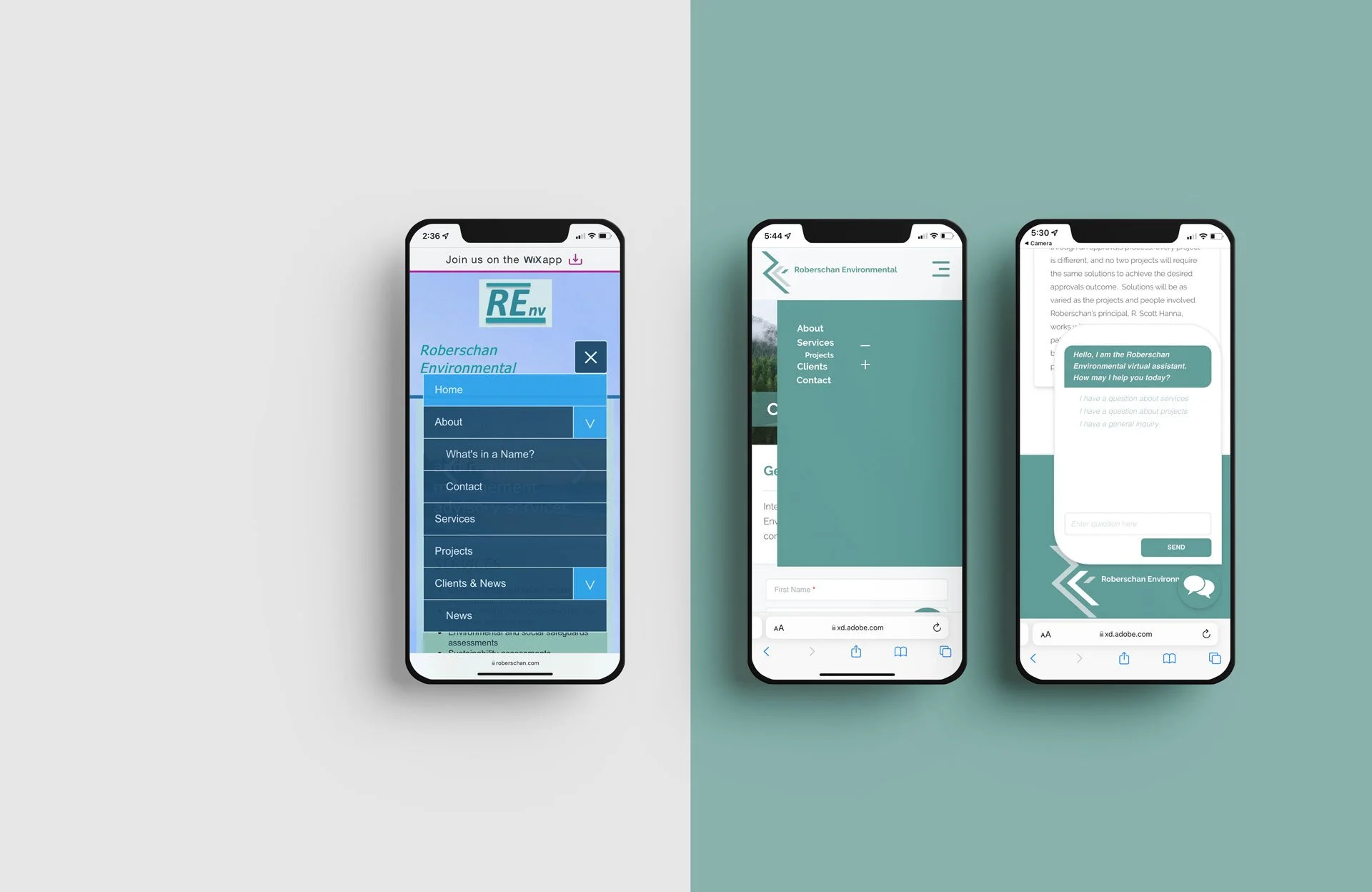
Collapsable Menu
The site menu contained several pages that could be consolidated. After redistributing the content, I simplified the menu to facilitate easier navigation of topics. In addition to this streamlined menu, I designed a chatbot feature to further assist users in locating content.
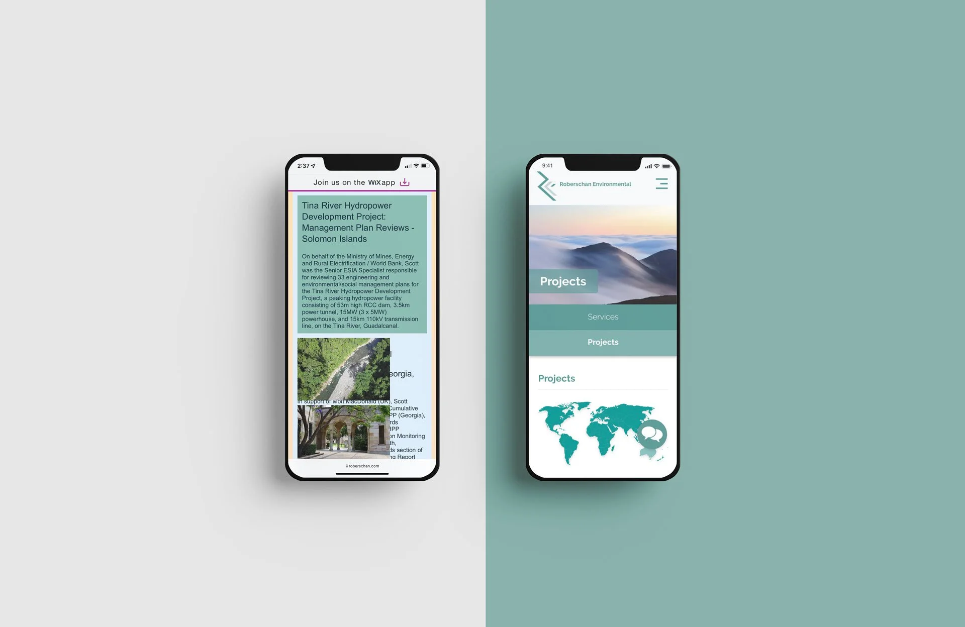
Projects Page
The main challenge with the projects page was overlapping content, excessive copy, and the way the information was presented. To address these issues, I organized the projects by region and created an interactive map that would allows users to explore projects specific to each area.
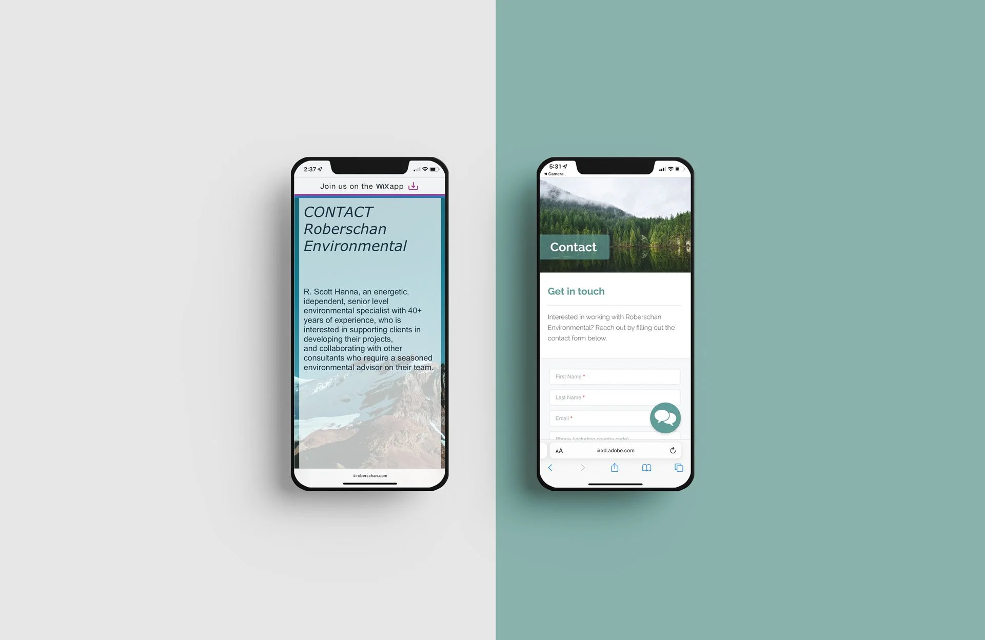
Contact Page
Finally, I moved the content from the original Contact page to the new About section. Since the Contact page did not provide a way for users to reach out to the consultancy, I integrated a fillable form, allowing users to submit requests and inquiries.